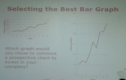
Discuss this problem with your parents and write your conclusion about the best graph and a reason for choosing that graph in the comments box below-
| Grade 5 J IST |
|
Discuss this problem with your parents and write your conclusion about the best graph and a reason for choosing that graph in the comments box below-
5 Comments
dhruv
12/2/2016 11:18:52 am
My mom said that the right one because it is going high and you get a lot of profit
dhruv
12/3/2016 11:41:24 pm
The units of the points of both the graphs are same. But the second graph visually represents a higher price increase with time, and that is why it is more convincing to the client to invest in my company.
Lilly and Dad
12/4/2016 07:32:29 am
My Dad said that he likes the right one because you also see those kind of graphs in news both graphs are positive but he right one there steeper and there for shoes more profit.
Mehek and mom
12/5/2016 07:06:56 am
My mom liked the right graph the most because, the profit in that graph shows that the business if representing the company well. Also shows a lot of profit than the other one.
Munir
12/8/2016 04:57:23 am
The graph on the right seems to show more of an increase in money. An investor will usually get part of the money. If the investor sees more of an increase in money they would be more likely to invest in your company. However, an investor could see that the money is going up so high that no one will buy the product. An investor may also look at the graph and see if he/she is being manipulated. Leave a Reply. |
AuthorWrite something about yourself. No need to be fancy, just an overview. Archives
February 2017
Categories |
 RSS Feed
